Learning to visualise data
Last week I had the opportunity to take a one-week course by Andy Kirk about data visualisation, hosted by Methods at Manchester as part of the Summer School programme. It was a fantastic experience to be a student again, and I learned a lot about practical considerations that go into producing effective visualisations that are trustworthy, accessible, and elegant.
I will not (and cannot) summarise the course here, I recomment anyone interested in creating data visuailisations to get in touch with Andy for courses. But I did want to quickly summarise some key take aways, list some really awesome tools, and show off some creations from the course.
Take aways
I really liked how the course was software agnostic, instead of teaching how to create particular plots with R or Tableu or something specific, the aim was to teach design thinking, and to take time to consider everything that goes into the data visualisation process.
The most useful thing for me to structure my approach to visualisation I think came from the 4-step breakdown of the visualisation process. It really made organising my thinking about how to get from question to visualisation easier. The steps are:
- Formulate a brief - why are you doing this? what/who is it for? what question is it answering?
- Work with the data - think about what data is required and also what format the data need to be in to allow the visualisation to be created
- Establish editorial thinking - really focus on what you want to say, to guide how to say it. we talked about the angle of the approach, and framing in relation to this.
- Develop design solution - finally think about the key decisions that go into the visualisation design: data representation, interactivity, annotation, colour, and composition, and how these all contribute to creating a trustworthy, elegant, and accessible piece.
Finally, many of the exercises involved looking at existing pieces of visualisation and really thinking about what I like and don’t like about them. This turned out to be a really good starting point to think about what is a good and not so good way to develop my own visualisations. Not only that, but using a google sheet to collect class responses to answers to “how much they like/dislike” some elements really got a discussion going and good engagement - something I might try in my teaching going forward.
Resources
Andy provided loads of great resources for people to use and refer back to when creating visualisation projects.
On his site visualisingdata.com there is a resources tab which lists a pretty much never-ending list of tools. Some which stood out to me where:
D3.js - I feel like this is the ultimate visualisation tool and I’ve dabbled with it here and there but I cannot find the time to buckle down and get to grips with Javascript. Not that I haven’t tried, I do remember trying to start a book club going through Eloquent Javascript but it does require an inital time investment, and when the good people of open source are wrapping all these javascript libraries into R packages, then my main incentives are removed. But it is definitely on the todo list.
R - R is so good for data visualisation, and so much easier to learn than Javascript (to me anyway) and also deals so well with all the data manipulation side of things, so it’s a 10/10 from me.
Flourish - this tool has lots of pre-programmed charting options, and is free to use for public data. I think if you need to keep the data private it begins to cost though…
RAWgraph - seemed to be this GUI for creating D3 visualisations. So if you’re interested in creating non-standard chart types, this look like a super easy way to do so, and is free.
Gephi - useful for network visualisation & easy to use and also totally free.
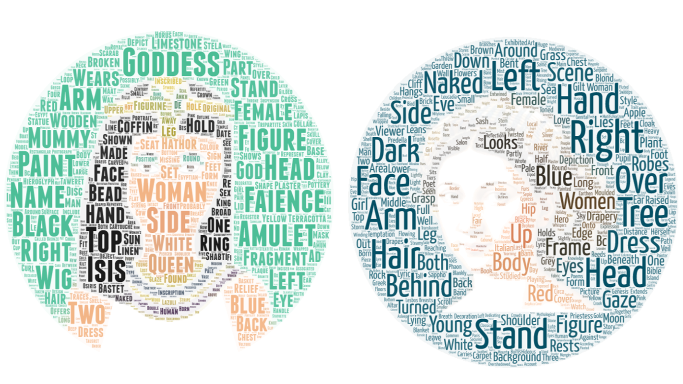
In addition to these, during one of the group exercises our group discovered word art - no, not the late 90s MS Word 3D rainbow coloured clipart thing, but a tool to make a wordcloud take the shape of any image you want. I know, I know, word clouds are “the mulletts of the internet”, but we did use this to produce some neat visualisations of text, so hey, mulletts can be useful too. For our challenge visualising data about art collections, we looked at words used to describe representations of women in modern art and egyptian art:
Another useful tool was the Chartmaker Directory a crowdsourced collection of all the different charts you could think to use for your data, and a set of all the tools that you can make them in. And if there is something missing which you think should be there, you can submit for it to be added. Very useful tool to help you create your descired visualisation no matter what tool you use.
Exercises
The really neat part about being a student again was to explore cool and totally not-related-to-my-work data sets for visualisation. The first one of these was the scripts for the original Star Wars trilogies. The task was to think about what we want to visualise from the data and how. The dataset was split over 3 sheets in Excel (one for each film) and only had 3 variables, sequence (the lines numbered 1-n from first and last line spoken in each film), name of the character speaking, and the line which they said. Inspired by the New York Times visualisation about Peyton Manning’s Touchdowns I decided to see who speaks the most in the films. I used R, so I’ll include the code for the graph here too. I don’t know if the data is up for sharing, but you can easily find transcribed films online, so could reproduce with such data:
library(readxl)
library(ggplot2)
library(tidyr)
library(dplyr)
library(stringr)
library(janitor)
#read in each sheet, create a variable to tag film, and merge into one dataframe
newhope <- read_excel("data/2.OriginalStarWarsScripts.xlsx", sheet = "SW_EpisodeIV") %>% clean_names() %>% select(line_number, character, dialogue)
newhope$film <- "SW_Episode_IV"
newhope$X__3 <- NULL
empire <- read_excel("data/2.OriginalStarWarsScripts.xlsx", sheet = "SW_EpisodeV")%>% clean_names() %>% select(line_number, character, dialogue)
empire$film <- "SW_Episode_V"
jedi <- read_excel("data/2.OriginalStarWarsScripts.xlsx", sheet = "SW_EpisodeVI") %>% clean_names() %>% select(line_number, character, dialogue)
jedi$film <- "SW_Episode_VI"
all_sw <- rbind(newhope, empire)
all_sw <- rbind(all_sw, jedi)

#create new requence to paste together all 3 films
all_sw$pos <- 1:nrow(all_sw)

#create new variable that counts the number of words in each line
all_sw$nwords <- sapply(strsplit(all_sw$dialogue, " "), length)

#get cumulative words spoken at each line for all characters
talk_vol <- all_sw %>% select(character, nwords, pos, line_number)
test <- talk_vol %>%
  spread(character, nwords) %>%
  replace(is.na(.), 0) %>%
  gather("who", "num_chars", -pos, -line_number)
test$csum <- ave(test$num_chars, test$who, FUN=cumsum)

#get the top 10 speakers to highlight them in the chart
top10 <- test %>% group_by(who) %>%
  summarise(talks = max(csum)) %>%
  arrange(desc(talks)) %>% head(n = 10) %>%
  pull(who)

#make points
pts_test <-  test %>%
  filter(who %in% top10) %>% group_by(who) %>% summarise(max_char = max(csum),
                                                         max_pos = max(pos))
#plot
ggplot() +
  geom_vline(xintercept = 1, colour="#A9A9A9", linetype="dashed") +
  geom_vline(xintercept = 1011, colour="#A9A9A9", linetype="dashed") +
  geom_vline(xintercept = 1850, colour="#A9A9A9", linetype="dashed") +
  geom_text(aes(x=1, label="New Hope", y=4600), colour="#A9A9A9", hjust = -0.1) +
  geom_text(aes(x=1011, label="Empire Strikes Back", y=4600), colour="#A9A9A9", hjust = -0.1) +
  geom_text(aes(x=1850, label="Return of the Jedi", y=4600), colour="#A9A9A9", hjust = -0.1) +
  geom_line(data = test, aes(x = test$pos, y = test$csum, group = test$who), alpha = .4) +
  geom_line(data = test %>%  filter(who %in% top10), aes(x = pos,
                y = csum,
                colour = who)) +
  geom_point(data = test %>%
               filter(who %in% top10) %>% group_by(who) %>% summarise(max_char = max(csum),
                                                                      max_pos = max(pos)), aes(x = max_pos,
                         y = max_char,
                         colour = who)) +
  geom_text(data = test %>%
              filter(who %in% top10 &
                       who != "BEN" ) %>% group_by(who) %>% summarise(max_char = max(csum),
                                                                     max_pos = max(pos)),
            aes(x = max_pos, y = max_char, label=str_to_title(who), colour = who),hjust= -0.1, vjust=0.5, size = 4.5) +
  geom_text(data = test %>%
              filter(who == "BEN") %>% group_by(who) %>% summarise(max_char = max(csum),
                                                                     max_pos = max(pos)),
            aes(x = max_pos, y = max_char, label=str_to_title(who), colour = who),hjust= -0.1, vjust= 0, size = 4.5) +
  theme_minimal() +
  theme(legend.position="none", text = element_text(size = 16),
        axis.text.x=element_blank(),
        axis.ticks.x=element_blank(),
        plot.margin = unit(c(1,0.5,0,0.5), "lines")) +
  labs(title="Cumulative number of words spoken \n by characters in original Star Wars trilogy",
        x ="", y = "")  +
  xlim(c(0,3000)) +
  ylim(c(0,4700)) +
  scale_colour_brewer(palette = "Paired")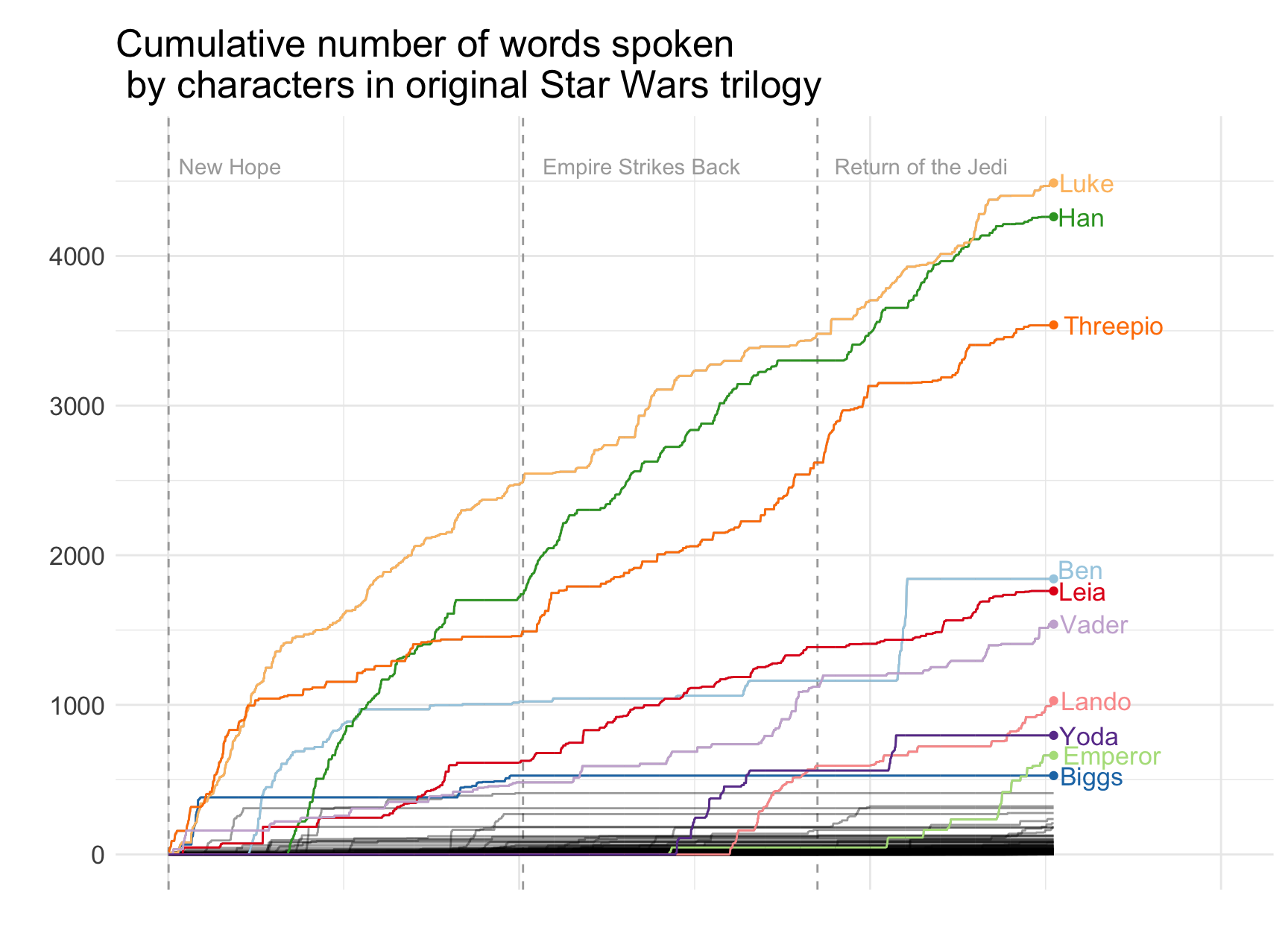
We also got to work with data from the Manchester Museum, Withworth Gallery, and Manchester Art Gallery. Together with another classmate, we used these data (which I am more sure I probably shouldn’t share, but I am sure that interested people could get in touch with the Manchester Museum Group to ask) to visualise gender representation in the Manchester Museum’s Egypt collection, and the Manchester Art Gallery. Our final product looked like this:
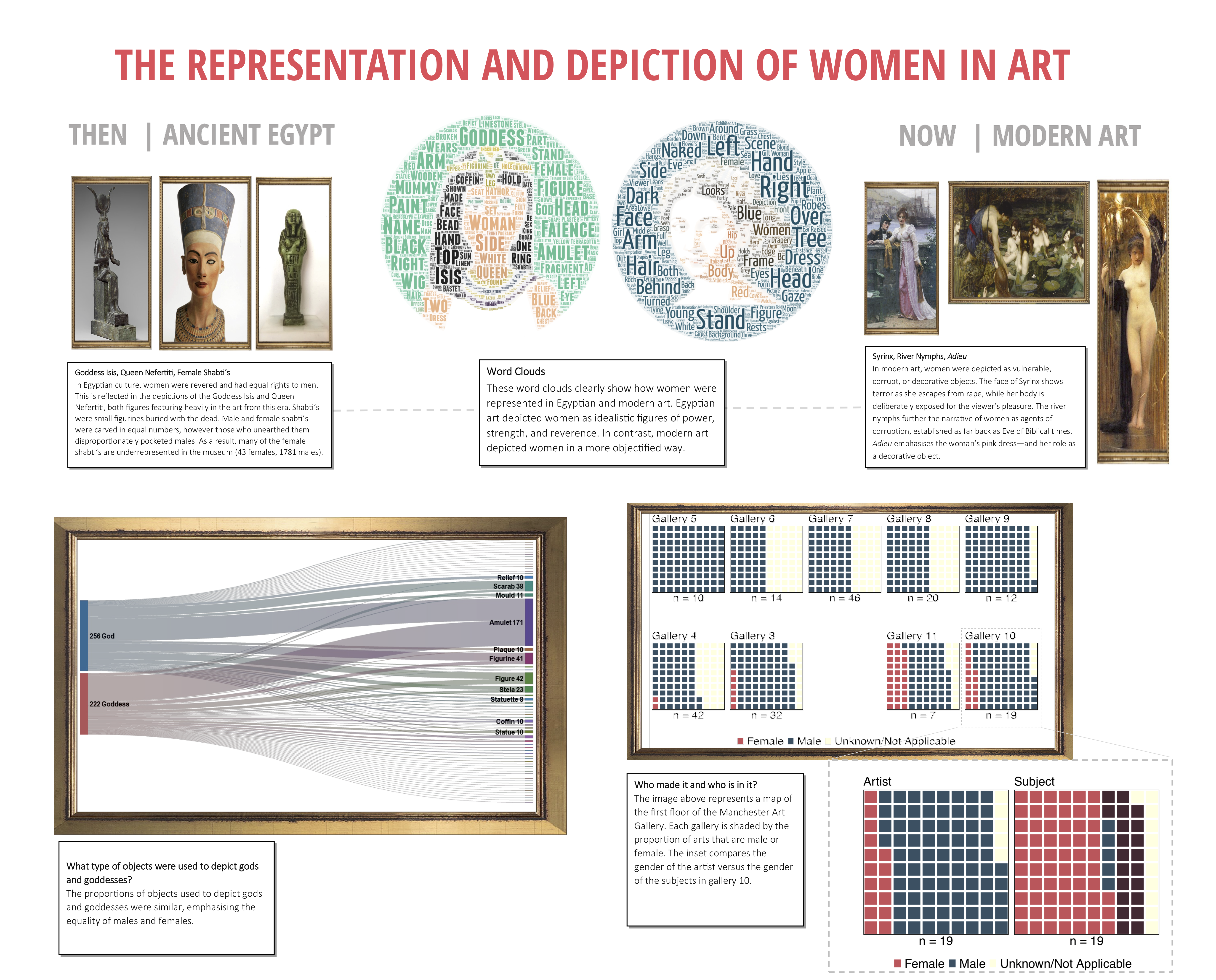
My colleague Vibhuti made the sanky diagram using Flourish mentioned above, and represents the types of artifacts that gods vs goddessess were represented with. I made the floor plan of the Manchester Art Gallery, with each room shaded by the proportion of paintings painted by male v female artists using the waffle package and the gridExtra package in R. We assembled everything in MS Publisher. Overall it was good fun and we got to present the results to members of the Manchester Museums Group, so very useful.
A note on accessibility
There was a lot of talk about accessibility of charts and this was I think a really important thing to always keep in mind. We discussed accessibility as in is the chart usable, is it suitably understandable, and therefore accessible to the audience but also discussed accessibility in terms of considering colourblind users for example. Some resources for this:
- colororacle.org gives a way to check if your colour scheme is colourblind
- colorbrewer has colourbling friendly pallette suggestions
- and in our final project we used coolors.co which generates a colour palette for you, and allows you to check if its colourblind friendly with different types of colourblindess simulated.
One thing we didn’t talk about (and I appreciate may be out of scope for the course for now) is accessibility of visualisations for those people with visual impairments who would use for example a screen reader to interpret our charts. It would be interesting to learn more about this, and if anyone knows some best practice on making charts even more accessible, I would welcome any tips and links to resources.