class: center, middle, inverse, title-slide # Even beautiful maps can be misleading ## How decisions about spatial data visualisation affect map legibility ### Réka Solymosi ### University of Manchester ### 28/07/2020 --- background-image: url(img/covid19map.png) ??? Image credit: [Andisheh Nouraee](https://twitter.com/andishehnouraee/status/1284237474831761408) --- background-image: url(img/covid19mapcontext.png) ??? Image credit: [Andisheh Nouraee](https://twitter.com/andishehnouraee/status/1284237474831761408) --- class: center, middle # Maps: visual representation of spatial data --- # About me .pull-left[ Réka Solymosi - [@r_solymosi](https://twitter.com/r_solymosi) - [rekadata.net](https://rekadata.net/)   ] -- .pull-right[ - Data analysis - GIS - Visualisation - crime, transport, policing - 'new' forms of data - R ] --- # Crime Mapping Forthcoming textbook based on our UoM Crime Mapping module: .center[ [https://maczokni.github.io/crime_mapping/](https://maczokni.github.io/crime_mapping/) ] --- class: inverse, center, middle # Why maps? --- class: center, middle # Much of human activity happens 'somewhere' --- # So we see maps everywhere .center[ 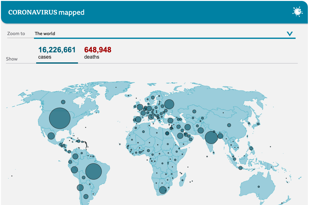 ??? Image credit: [BBC News](https://www.bbc.com/news/world-51235105) ] --- # Some are very useful! Optimal Manchester brewery crawl (see [https://www.ncalvert.uk/posts/drunkensalesman/](https://www.ncalvert.uk/posts/drunkensalesman/)) 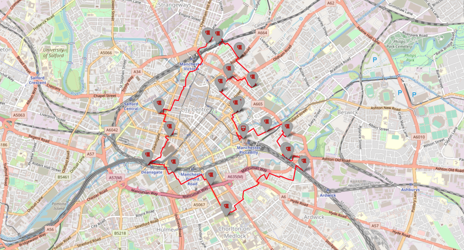 --- # But many are bad .center[ 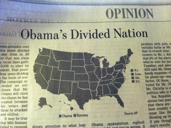 ??? Image credit: [Flowing data](https://flowingdata.com/2012/11/09/incredibly-divided-nation-in-a-map/) ] --- # Obligatory XKCD .center[  ] ??? Image credit: [XKCD](https://xkcd.com/1138/) --- # Sometimes bad maps are funny .center[ <img src="https://i.redd.it/63l70c76cwq01.jpg" height="500" /> ] --- # Some people collect bad maps .pull-left[ 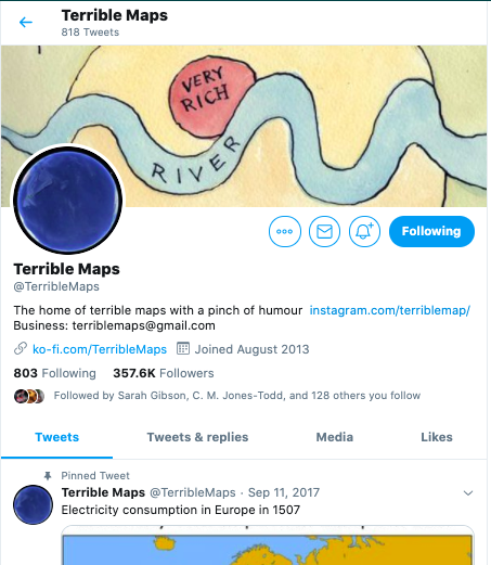 ] .pull-right[ [twitter.com/TerribleMaps](https://twitter.com/TerribleMaps) ] --- # Terrible(/y funny) maps  --- class: center, middle # Key considerations -- ### - What is the intended message? -- ### - How do different maps convey this message? --- # Two key fields -- .pull-left[ ### - cartography  ] -- .pull-right[ ### - (non-spatial) data visualisation  ] ??? Image credit: [Wikimedia commons](https://commons.wikimedia.org/wiki/Category:Coxcomb_(Florence_Nightingale)) --- class: inverse, center, middle # Empirical understanding of how people perceive different "viz" --- # Example 1: Pie charts --  Image credit: [Robert Kosara](https://eagereyes.org/blog/2016/a-reanalysis-of-a-study-about-square-pie-charts-from-2009) --- # Example 2: Tufte charts -- .center[  ] Image credit: [Bateman, S., Mandryk, R. L., Gutwin, C., Genest, A., McDine, D., & Brooks, C. (2010, April). Useful junk? The effects of visual embellishment on comprehension and memorability of charts. In Proceedings of the SIGCHI conference on human factors in computing systems (pp. 2573-2582).](https://dl.acm.org/doi/abs/10.1145/1753326.1753716) --- # Examples in cartography -- .center[  ] Image credit: [Flannery, JJ (1971) The relative effectiveness of some common graduated point symbols in the presentation of quantitative data](https://files.eric.ed.gov/fulltext/ED045469.pdf) --- class: inverse, middle, center # Addressing a specific problem: variation in the size and shape of areas --- # Eg: USA States .center[ <!-- --> ] --- # Eg: UK Local Authorities .center[ 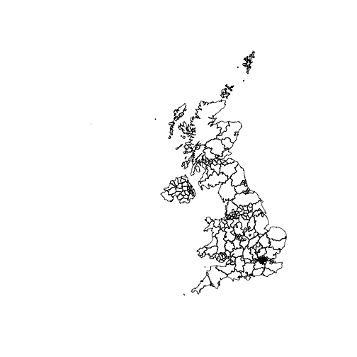<!-- --> ] --- # Message often obscured .center[ 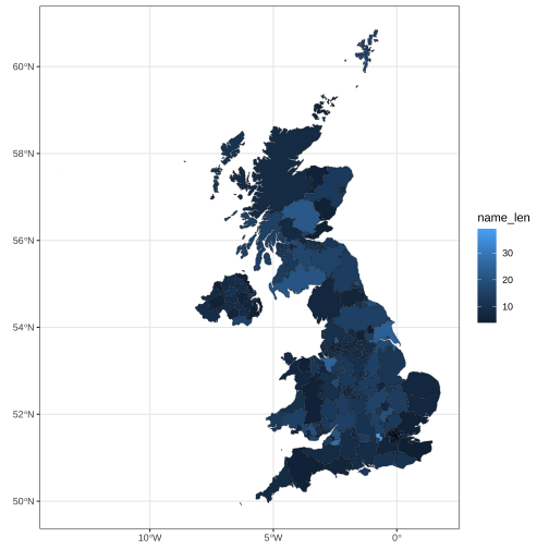<!-- --> ] --- # A fix: distort polygons .center[ 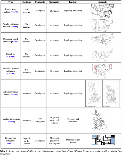 ] --- .center[ 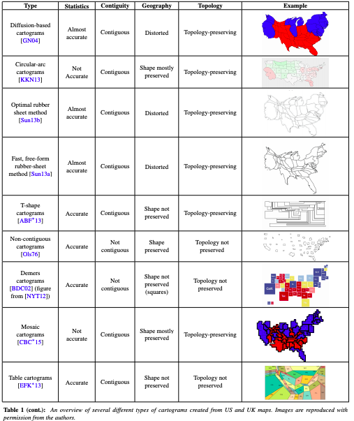 ] --- class: inverse, center, middle # How does this affect perception? --- # Our focus: EU referendum results .center[  ] --- # 4 types of distortions .center[  ] --- # (a) Balanced cartogram - From [Harris, R (2017) Hexograms: Better maps of area based data.](https://rpubs.com/profrichharris/hexograms) -- - Scale by min value to balance **invisibility** and **distortion** -- - Eg if SIU is 0.02 inches on a 5inch map: ```r siu <- 0.02 # the smallest interpretable unit height <- 5 bb <- sp::bbox(map) width <- (bb[1,2] - bb[1,1]) / (bb[2,2] - bb[2,1]) * height bbA <- (bb[1,2] - bb[1,1]) * (bb[2,2] - bb[2, 1]) mapA <- rgeos::gArea(map) minA <- (siu * bbA) / (height * width) map$scaleby <- rgeos::gArea(map, byid = TRUE) map$scaleby[map$scaleby < minA] <- minA # Use this to scale cartogram balcarto <- cartogram::cartogram(map, "scaleby", maxSizeError = 1.1, prepare = "none") ``` --- .center[  ] --- # (b) Hexogram - same idea as balanced carto, with minimum value being what allows each area to be represented as its own hexagon -- - hexagons are produced using the hexagonal binning function in R’s fMultivar package, based on the centroids of each polygon -- - our example: ```r # Get the function needed script <- RCurl::getURL("https://raw.githubusercontent.com/profrichharris/Rhexogram/master/functions.R") eval(parse(text = script)) # Number of bins guided by the -binN- function for a visual plot. # 29 is also used by Harris in example. harris.29 <- hexogram(LAE.sp, 29) # Extract the hexograms harris.29.hex.sp <- harris.29[[2]] # 2 is hexo ``` --- .center[  ] --- # (c) geogrid squre grid - From [Joseph Bailey](https://cran.r-project.org/web/packages/geogrid/readme/README.html) -- - Calculates a grid that strives to preserve the original geography. -- - 2 steps to using this - 1 - Generate grid by varying the seed - 2 - Efficiently calculate the assignments from the original geography to the new geography -- - Our example: ```r # step 1 generate grid LAE.reg <- calculate_grid(shape = LAE.sp, grid_type = "regular", seed = 1) #1 was our fave seed # step 2 calculate assignments LAE.reg <- assign_polygons(LAE.sp, LAE.reg) ``` --- .center[  ] --- # (d) geogrid hexagonal grid - Same idea as with grids but for hexagons: ```r # step 1 generate grid LAE.hex <- calculate_grid(shape = LAE.sp, grid_type = "hexagonal", seed = 1) # step 2 calculate assignments LAE.hex <- assign_polygons(LAE.sp, LAE.hex) ``` --- .center[  ] --- .center[ # "High values (in yellow) appear to be clustered near one another, with a handful of outliers elsewhere in the country" ] -- ### - 5-point Likert scale (strongly agree, slightly agree, neither agree nor disagree, slightly disagree, strongly disagree). -- - Higher agreement = better representation of statement in map -- - Convenience sample (internet) of 768 respondents --- # Results .center[ 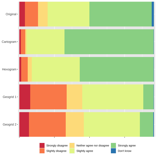<!-- --> ] --- # Results (contd.) .center[ 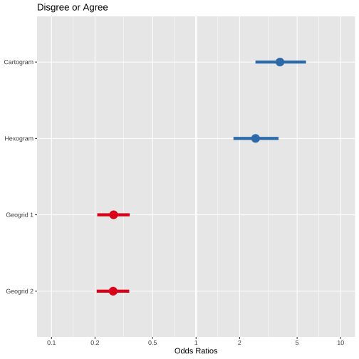<!-- --> ] --- # Conclusions - New methods to visualise geographic information **can** convey a message more accurately than original thematic maps. - But choose the method with consideration to the research question and the data! --- # Thanks! - The paper: [Langton, S. H., & Solymosi, R. (2019). Cartograms, hexograms and regular grids: Minimising misrepresentation in spatial data visualisations. Environment and Planning B: Urban Analytics and City Science.](https://journals.sagepub.com/doi/full/10.1177/2399808319873923) - These slides: [https://rekadata.net/talks/pydatamcr.html](https://rekadata.net/talks/pydatamcr.html) - Questions? Contact myself ([@r_solymosi](https://twitter.com/r_solymosi)) or Sam ([@sh_langton](https://twitter.com/sh_langton)) .small[ - Slides created via the R package [**xaringan**](https://github.com/yihui/xaringan). The chakra comes from [remark.js](https://remarkjs.com), [**knitr**](http://yihui.org/knitr), and [R Markdown](https://rmarkdown.rstudio.com). ]